Quickbrief
A quick and easy interactive brief form tailored specifically for the TV Product Creative Team at Virgin Media.

Background
No one likes to fill out forms, and this is evident when a submitter rushes through it and leaves important fields blank (or writes ’n/a’ in them). Long static forms also turn off the submitter, even if they are asked to fill out only a small portion of it. The TV Product Creative Team was often having difficulty collecting good briefs because of these issues.
I decided to create an interactive form that would address these common problems that plague static brief forms.
Features
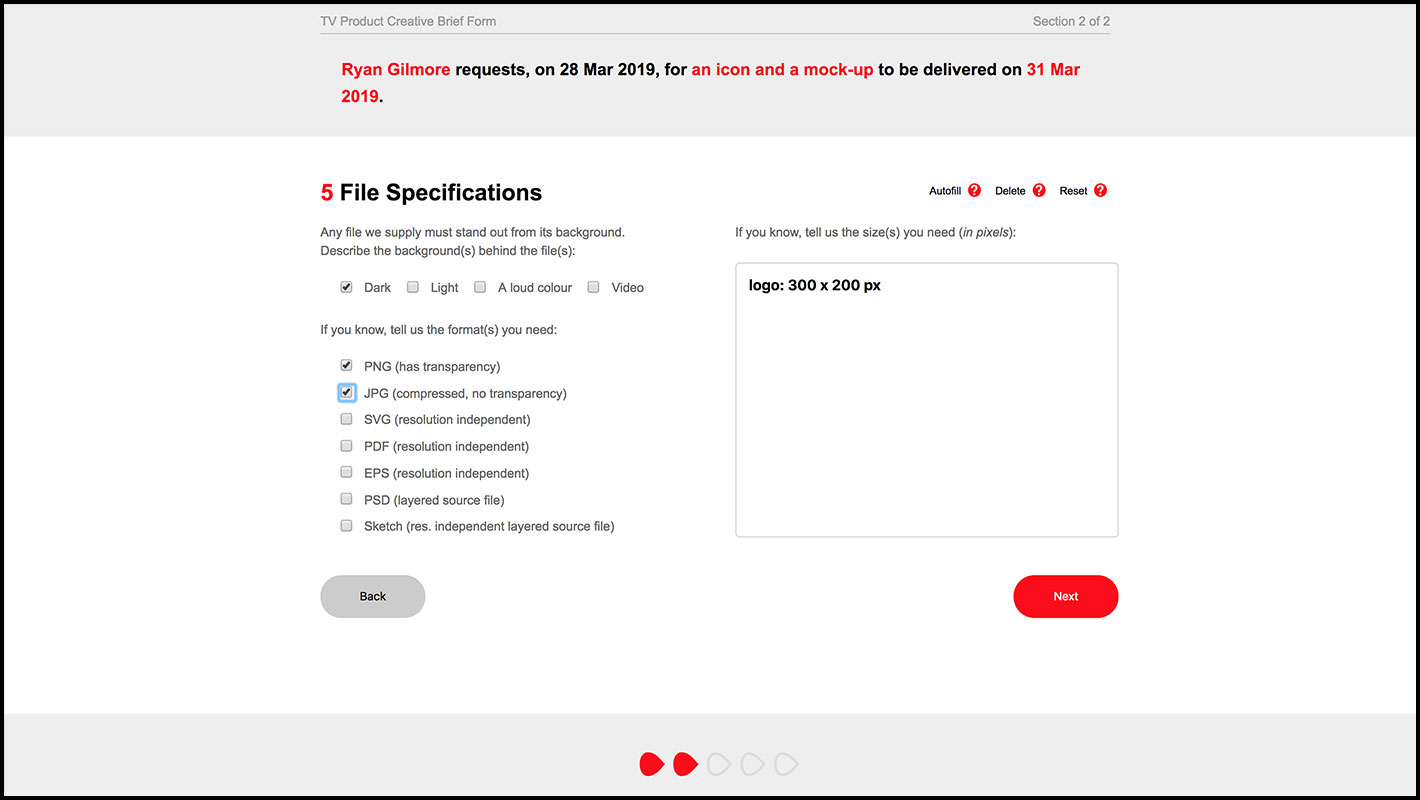
- A one sentence summary (stating who, what and when) appears at the top of the form, in real time, while it’s being filled
- Users are unable to advance if required fields are left blank, preventing user from leaving out important information.
- Universally clients often write ‘ASAP’ for a deadline, but this form forces the user to choose a date using a calendar picker.
- The length of Section 2 will depend on the questions answered in Section 1, making the form shorter and more relevant for smaller jobs.
- The majority of the form relies on multiple choice, so users don’t have to search for the right terms and can fill in the form very quickly.
- Users can ‘autofill’ a page based on data entered before.
- A page indicator at the bottom tells the user how many steps they have left
- The entire brief can be reviewed and edited as one page before being submitted.
- All briefs are saved on the server for retrieval later.
- UI design, coding: Ryan Gilmore
